Published on June 4, 2024
The Psychology of Color in Marketing

Have you ever wondered why companies choose certain colors to represent their brand? A lot more goes into it than just throwing random colors together. Companies strategically use the psychology of color to convey their marketing messages and influence consumer decisions.
When it comes to marketing, especially in print materials, the choice of colors can make or break the effectiveness of your campaign. Understanding the psychological effects of colors can help you create compelling and persuasive print advertisements, brochures, flyers, and other marketing materials.
Let’s delve into how different colors can be strategically used in printed marketing to capture attention, convey messages, and drive consumer action.
Psychology of Red
Red is often associated with excitement, passion, and urgency. It can stimulate appetite and is frequently used in food advertising. Red can also create a sense of urgency, making it useful for clearance, sales, and call-to-action buttons. Using red for high-impact visuals on banners and posters also grabs attention even from afar. Be careful though! Too much red can be overwhelming to your audience.
Psychology of Blue
Blue conveys trust, stability, and calmness. Corporate settings and healthcare industries often use blue because it inspires a sense of security. When it comes to print items such as flyers and brochures, use blue in sections that describe services or products to create a sense of reliability.
Psychology of Green
Green represents nature, growth, and harmony. Health, wellness, and environmental brands often use green to create a soothing and balanced look. Using green within your print ads to describe natural, organic, or wellness products helps consumers think of your company as the healthier option compared to others.
Psychology of Yellow
Yellow exudes warmth, optimism, and happiness. It grabs attention and creates a sense of cheerfulness and positivity. Use yellow for promotional products aimed at creating excitement and highlighting key information.
Psychology of Purple
Purple evokes a sense of luxury, creativity, and sophistication. It is often used for premium products and in beauty and wellness industries. Purple adds a touch of elegance and exclusivity, making it suitable for high-end marketing campaigns.
Psychology of Orange
Orange combines the energy of red and the happiness of yellow. It is often associated with enthusiasm, creativity, and encouragement. Use orange to create a sense of fun and playfulness, especially for promotional products, banners, and events.
Psychology of Black
Black conveys elegance and power. Luxury brands and formal events commonly use black in their branding. Black creates a strong and timeless look in your print materials, making it a good choice for professional and high-quality designs.
Psychology of White
White symbolizes purity, simplicity, and cleanliness. It is often used in healthcare, technology, and minimalist designs to create a sense of space and simplicity. White space in print items such as magazines, brochures, and posters can enhance readability, making it effective for sophisticated and clean designs.
Applying Color Psychology to Print
Align with Your Brand Identity
Ensure that your color choices align with your brand’s identity and message. Consistency in color usage across all printed materials helps reinforce brand recognition and loyalty.
Create Contrast and Hierarchy
Use contrasting colors to highlight important information and create a visual hierarchy. This helps guide the reader’s eye through the material and emphasizes key messages.
Test and Iterate
Before finalizing your printed materials, test different color combinations to see which ones work best. Gather feedback from a sample audience and make adjustments based on their responses.
Consider the Printing Process
Keep in mind how colors will appear in print compared to on screen. Colors can look different depending on the type of paper and printing method used. Always review proofs and make necessary adjustments to ensure color accuracy.
Using the psychology of color coupled with your unique business practices can take your print marketing from dull to instantly recognizable, increasing sales and brand loyalty. Bring color psychology into your print job with Fox Press and watch the benefits roll in.

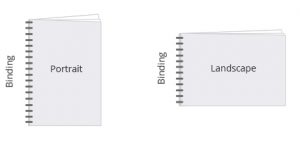
 Long Edge Binding Short Edge Binding
 Saddle Stitched

 Choose the color option for the inside pages of your cover.